Simple Render View
The Simple Render View allows you to create interfaces through an interactive form using a no-code approach. With this component, it’s possible to create lists, tables, buttons, images, headings, paragraphs, and more.
Similar to other components, a mandatory Component name (Figure 1 - 1) is required.
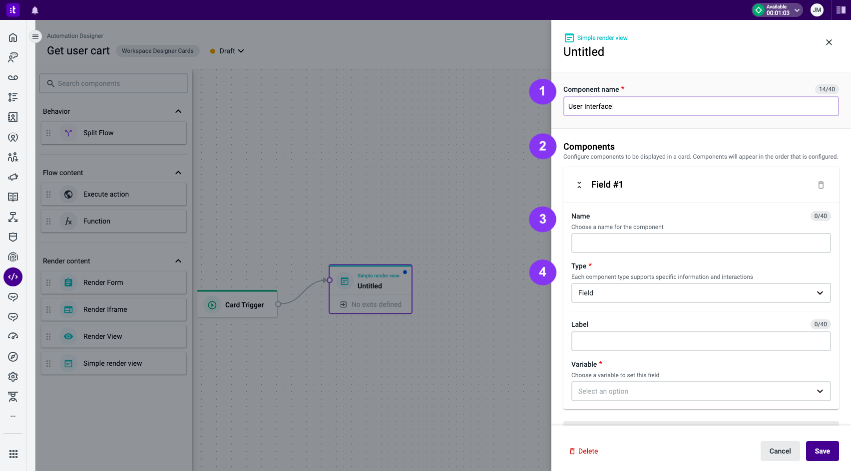
Figure 1 - Simple Render View settings
The Simple Render View component is based on Components (Figure 1 - 2). Those are UI elements that will be displayed on a card.
The component configuration is based on two common fields: Name (Figure 1 - 3) and Type (required field; Figure 1 – 4). Name is an identifier for that specific UI component, and Type is the type of interface. The available types are:
Each component type has its own set of fields and a clear objective, as explained below.
Button
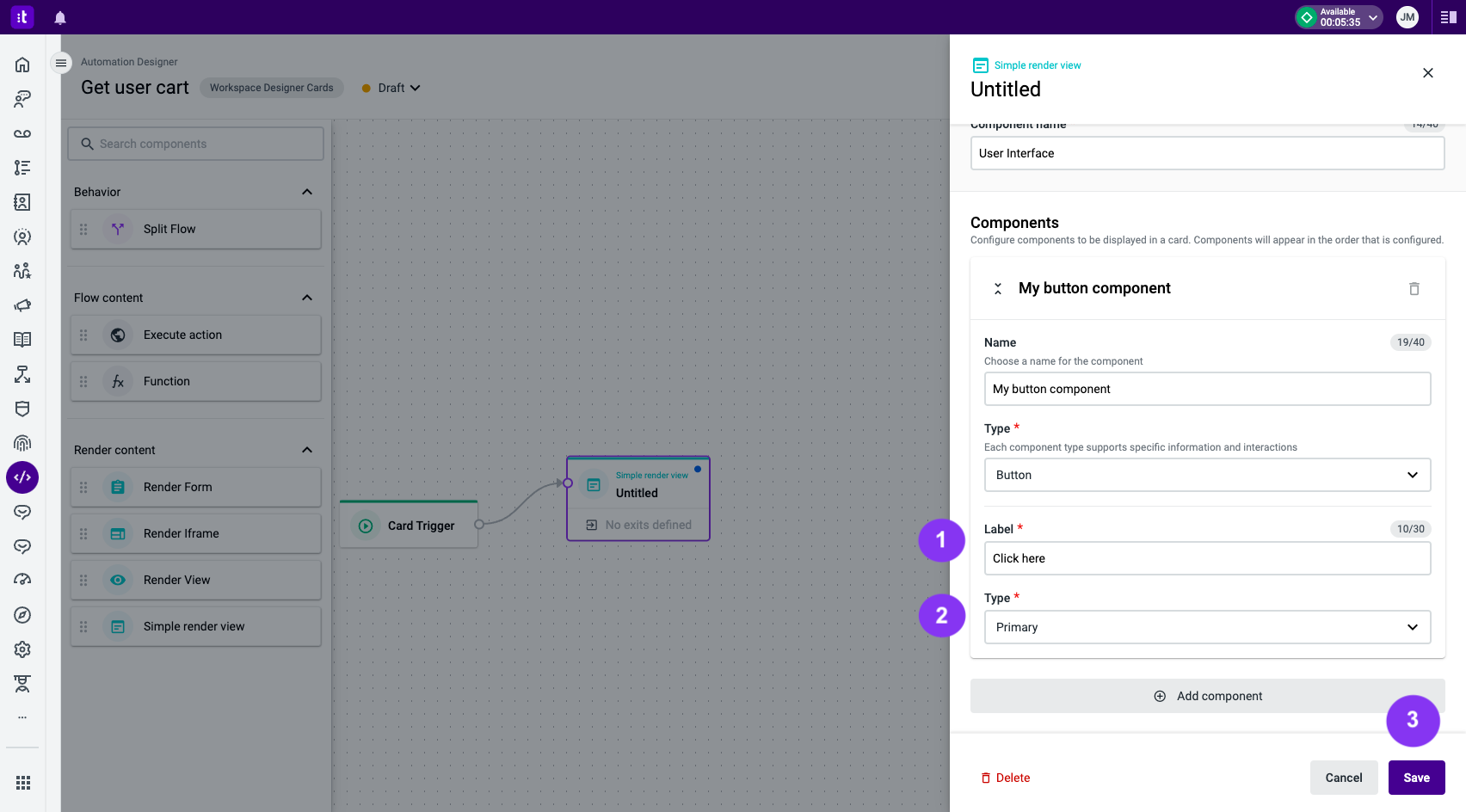
Figure 2 - Button component settings
The Button component type renders a button on the interface. The configuration is composed of a Label (Figure 2 - 1), which will be the text the button will display, and a Type (Figure 2 - 2). Depending on the type chosen, a different button style will be displayed (Figure 3).
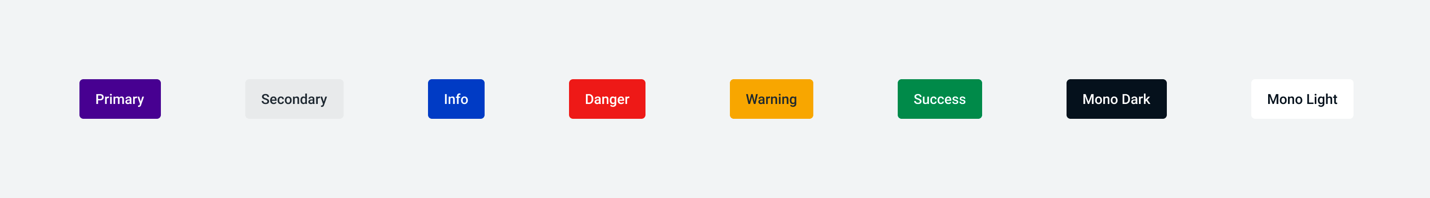
Figure 3 - Available button types
Once you're done filling out all the form fields, click the Save button (Figure 2 - 3).
Field
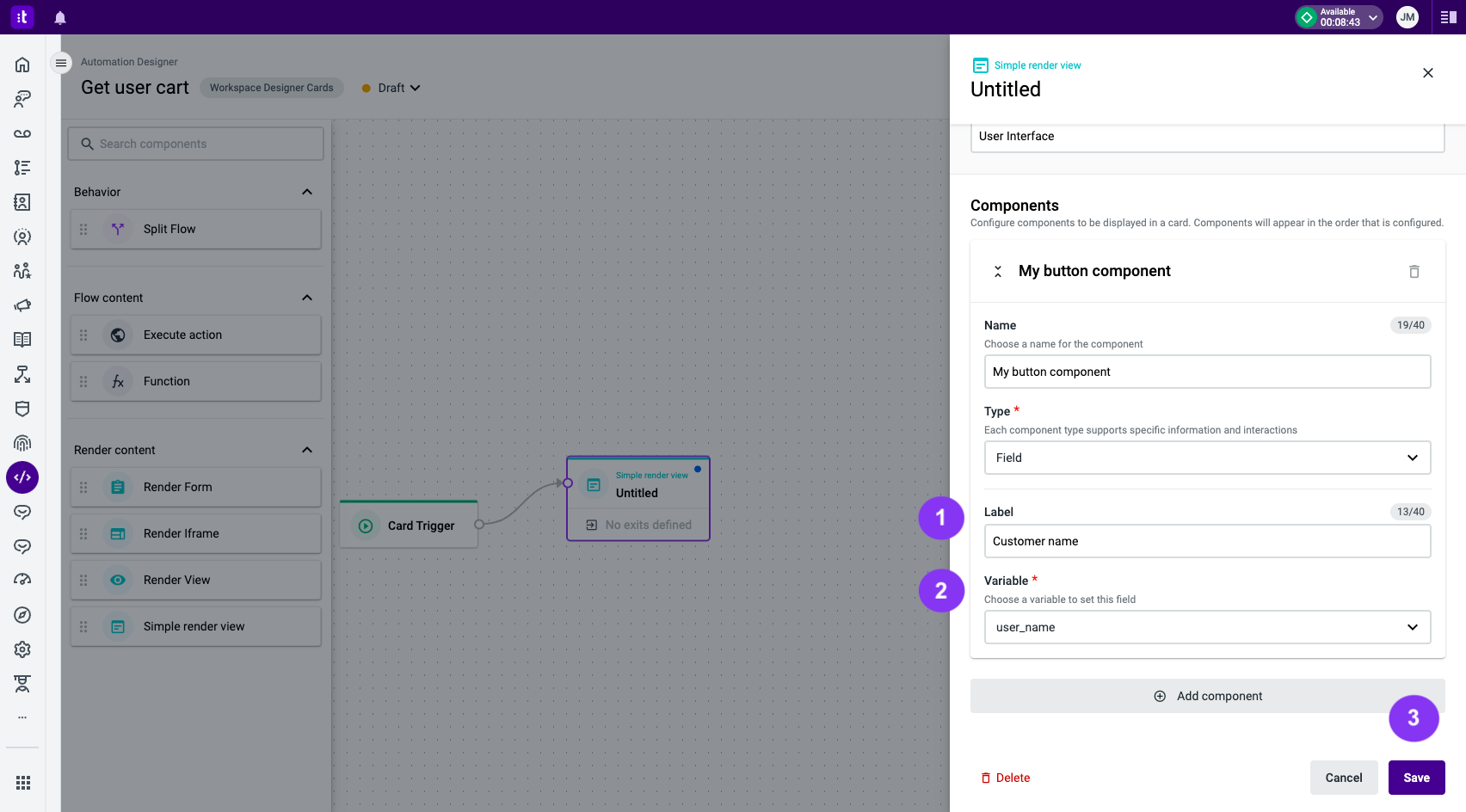
Figure 4 - Field component settings
The Field component type displays a variable name with a label indication. The configuration is composed of a Label (Figure 4 - 1), which will be the label text above the value, and a Variable (required field; Figure 4 - 2), which must be associated with a variable to be displayed. E.g.:
Customer name
John Doe
Once you're done filling out all the form fields, click the Save button (Figure 4 - 3).
FieldGroup
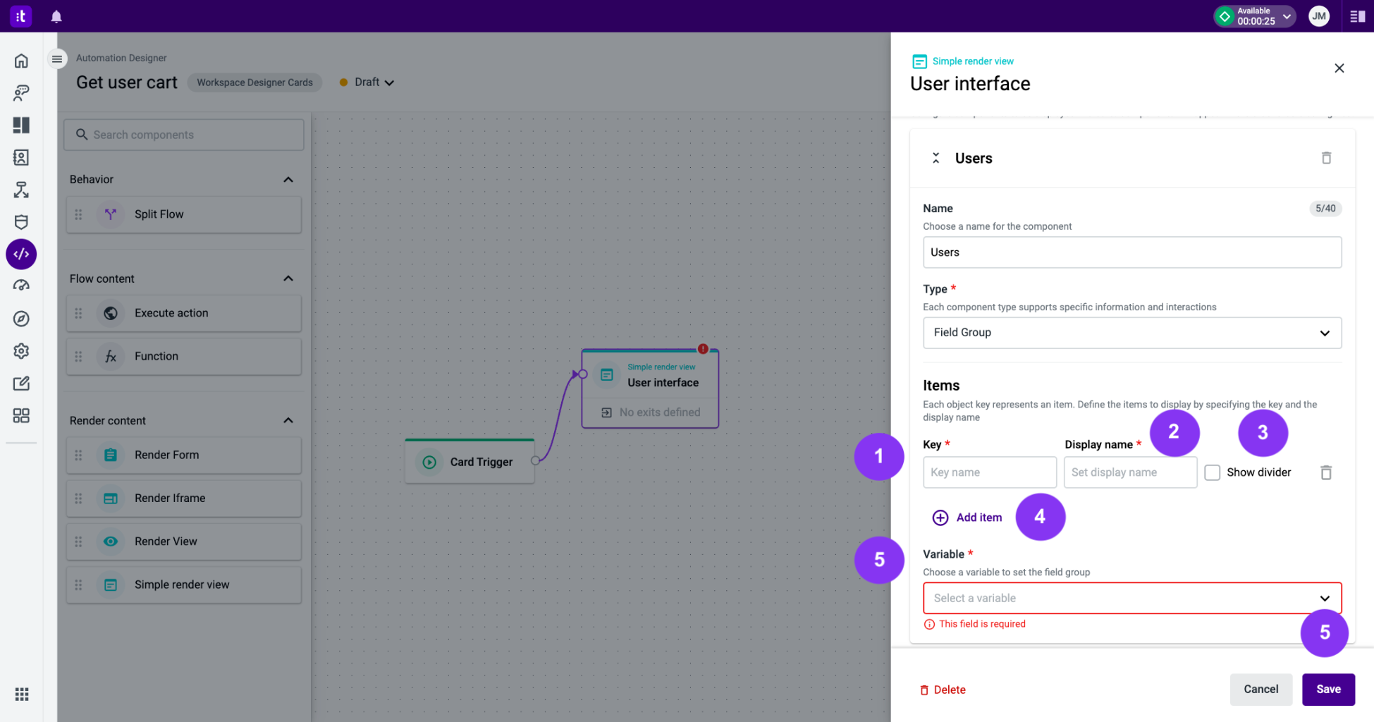
Figure 5 - FieldGroup component settings
The FieldGroup component type displays an object. Each object key will be a list item.
The configuration is composed of an Items section. In this section, you can define the items to display by specifying:
- The object Key (required field; Figure 5 - 1).
- The desired Display name (required field; Figure 5 - 2).
- An optional divider between this and the next item. You must tick the box to use this divider (Figure 5 - 3).
To add more items to the component:
- Click the Add item (Figure 5 - 4) button.
- Use the Variable (required field; Figure 5 - 5) input field to select the variable that contains the desired object.
Once you're done filling out all the form fields, click the Save button (Figure 5 - 5).
Table
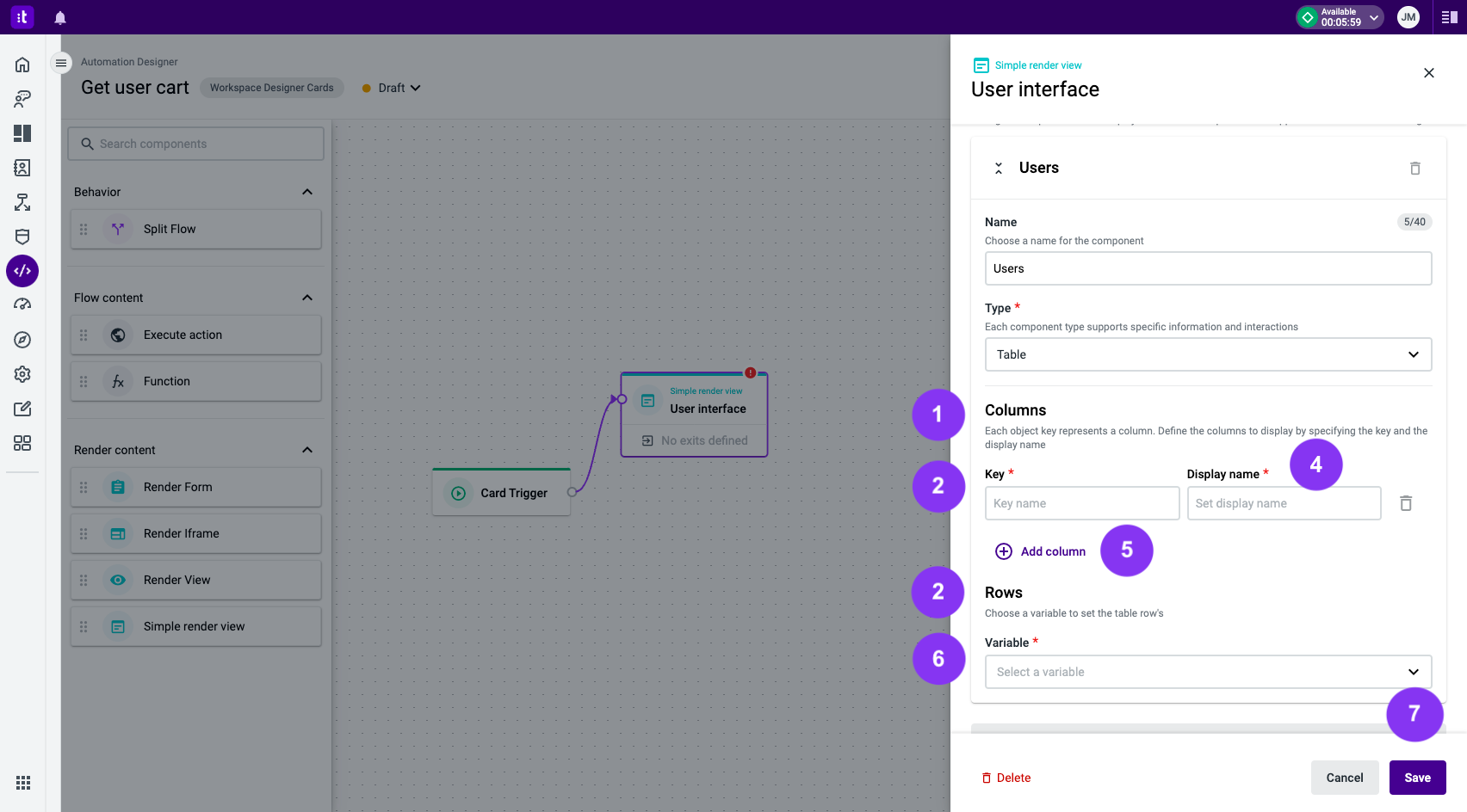
Figure 6 - Table component settings
The Table component type displays an array of objects. Each array element will be a table row, while each key in the object will be a column.
The configuration is composed of a Columns (Figure 6 - 1) section and a Rows (Figure 6 - 2) section. In the Columns section, you can define the columns to display by specifying:
- The object Key (required field; Figure 6 - 3).
- The desired Display name (required field; Figure 6 - 4).
To add more columns to the component:
- Click the Add column (Figure 6 - 5) button.
- Use the Variable (required field; Figure 6 - 6) input field to select the variable that contains the desired array of objects.
To create a child object key, use the dot notation. For example, using the object:
{
  name: {
    first_name: "John",
    last_name: "Doe"
  },
  age: 30
}
You can define these fields:
| Key | Label |
|---|---|
| name.first_name | First Name |
| name.last_name | Last Name |
| age | Age |
Each object inside the array must have the same keys in order for the table to be properly rendered
Once you're done filling out all the form fields, click the Save button (Figure 6 - 7).
Text
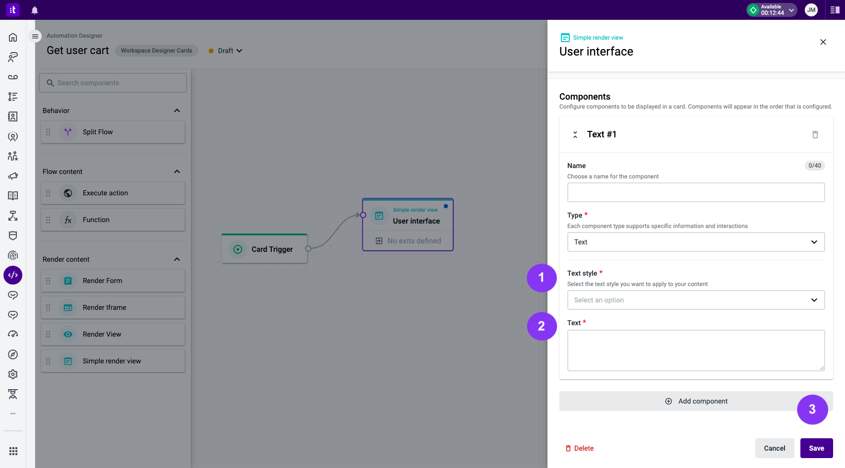
Figure 7 - Text component settings
The Text component type renders static information using several typography elements. The configuration is composed of a Text style (Figure 7 - 1) and a Text (Figure 7 - 2) field.
Once you're done filling out all the form fields, click the Save button (Figure 7 - 3).
Image
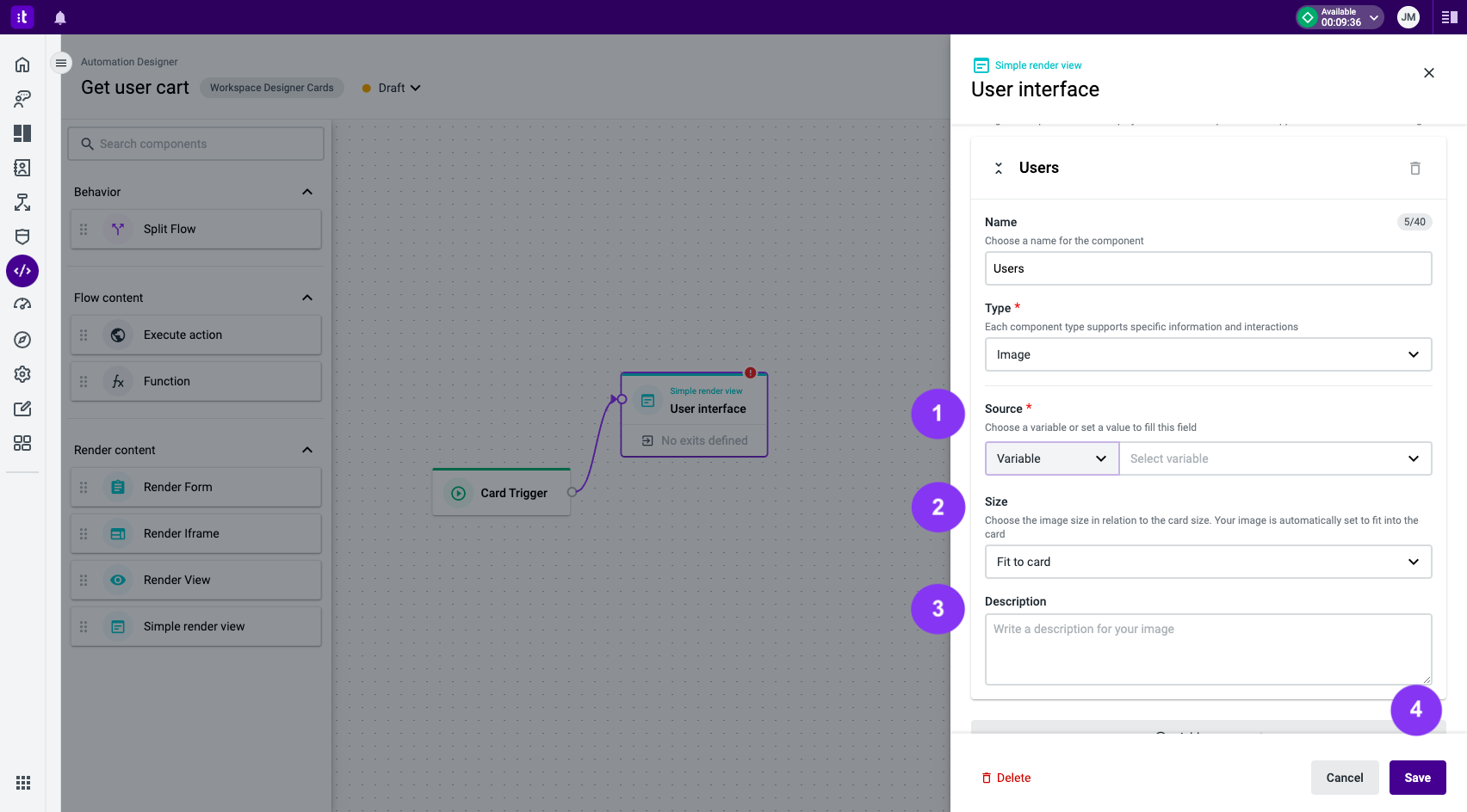
Figure 8 - Image component settings
The Image component renders an image. The configuration is composed of a Source (required field; Figure 8 - 1), Size (Figure 8 - 2), and a Description (Figure 8 - 3) field.
In the Source field, you can choose a Variable (Figure 9 - 1) which contains the image URL, or a hard-coded Value (Figure 9 - 2).
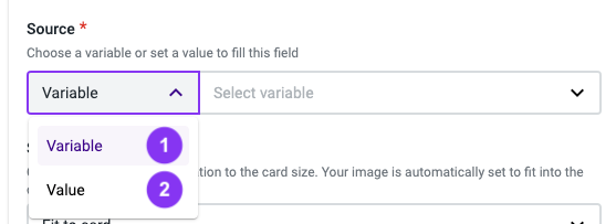
Figure 9 - Source settings
In the Size field (Figure 8 - 4), you define the image size, selecting between a percentage related to the card size and the Fit to Card option, which will expand the image to fit the full card size.
In the Description field (Figure 8 - 5), you can define an optional description to appear below the image.
Once you're done filling out all the form fields, click the Save button (Figure 8 - 4).
Troubleshooting
If you have questions or technical issues, please open a ticket using this form.
Updated 6 months ago