Render View
The Render View allows you to write custom JSX to create interactive interfaces. It is also possible to define Exits and, based on user interaction, route the flow through the intended exits. Exits settings can be accessed by double-clicking the component.
Render ViewNative React components are not supported.
There are two available tabs (Figure 1): Code (1) and Exits (2).
The Code tab displays a code editor (3), a required field. This editor accepts HTML and JSX so you can create the desired interfaces.
Card Preview (Figure 1 - 4) - a button to preview the content of the card.

Figure 1 - Render View configuration panel
The Exits tab (Figure 2 - 5) allows the configuration and management of custom exits that, based on a user interaction, will trigger the execution through that specific path. To add exits, click the Add exit button (Figure 2 - 6).
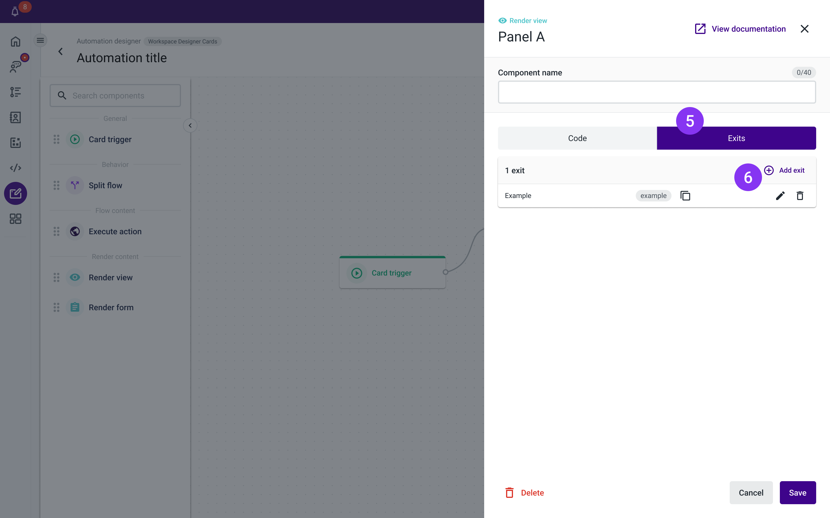
Figure 2 - Render View Exits tab
After defining the exit name (Figure 3 - 7), you can copy the slug (Figure 3 - 8) within the modal or after clicking on the Confirm button (Figure 3 - 9).
The exit name is required, must be unique, and contain only letters and numbers. Special characters are not allowed.
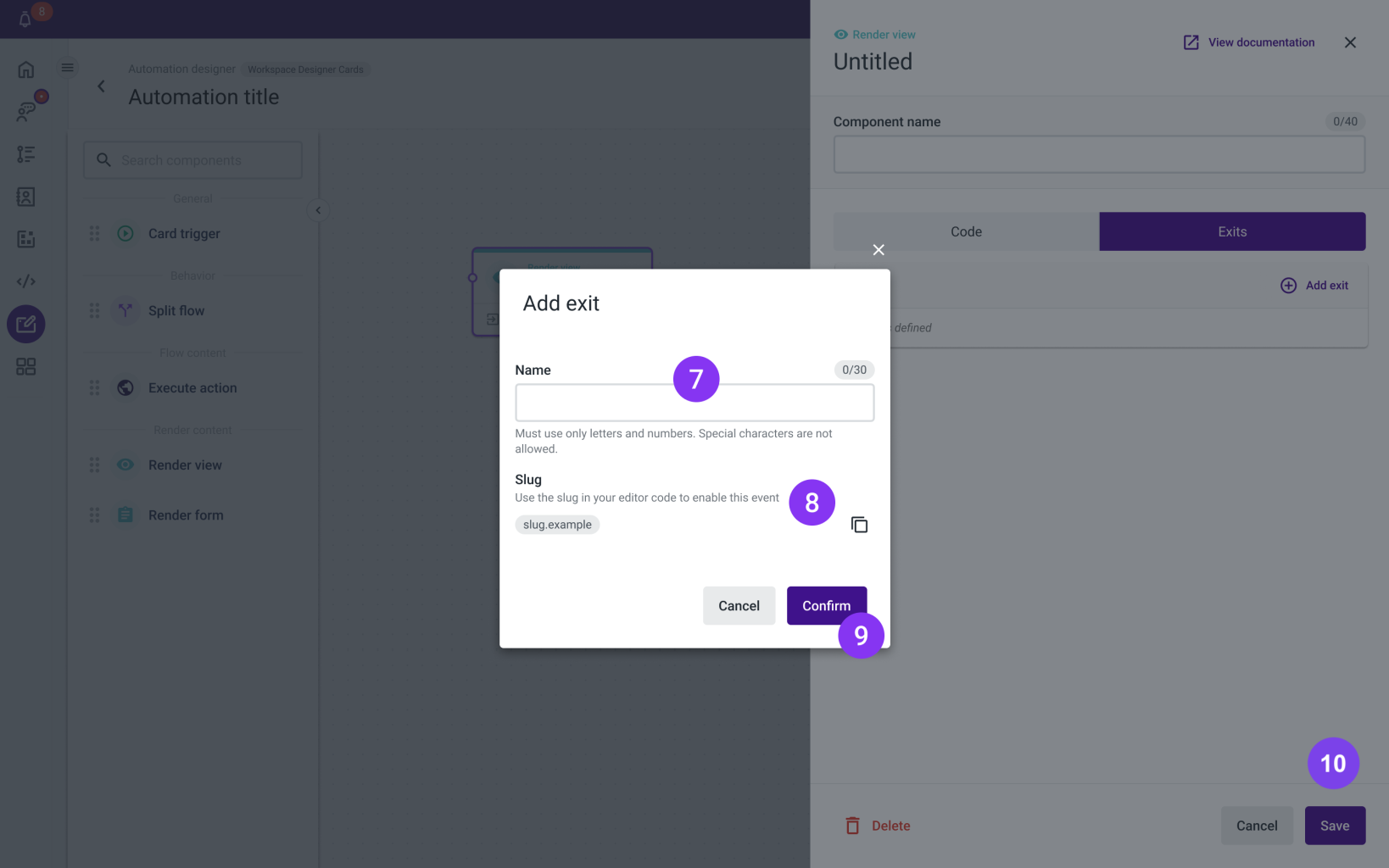
Figure 3 - Add exit modal
Exits
The Render View allows you to define multiple exits.
To use the Exits in the Render View, use this syntax in the code of the component: actions.goToExit(“<exitSlug>”).
Calling this function will trigger the next step of the flow by calling the dispatch function, for instance when the user clicks on a Button.
<Button onClick={() => actions.goToExit("back")}>Back</Button>Once you're done filling out all the form fields, click the Save button (Figure 3 - 10).
Troubleshooting
If you have questions or technical issues, please open a ticket using this form.