The Code Editor
Both HTML and JSX can be used in the code editor tab.
Compatible Components
To maintain consistency of the experience, other React components are supported as described below. All components accept the HTML style attribute and their default HTMLElement properties.
- The HTML style is an attribute that takes an object (e.g. style={"backgroundColor":"#00FF00"}).
- Since the code editor accepts JSX, className must be used instead of the HTML class attribute.
Layout Components
Flex - built to easily align items on a container.
Available Properties
1 - gap - defines the space between child elements. Accepts an integer that uses a 4 px multiplier.
2 - direction - sets the direction of the flex container. It can be a:
2.1 - row - the flex container's main-axis is defined to be the same as the text direction. The main-start and main-end points are the same as the content direction.
2.2 - column - the flex container's main-axis is the same as the block-axis. The main-start and main-end points are the same as the before and after points of the writing-mode.
3 - alignX and alignY - based on the direction property, these two properties define the horizontal and vertical alignment of the child elements:
3.1 - start, center, and end: pack items around the respective position in the container.
3.2 - space-around, space-evenly, space-between and stretch: distribute items in the container.
Both the direction and the AlignX and AlignY properties are based on the respective flex-direction, align-items and align-content CSS properties. For more information, please read the World Wide Web Consortium (W3C) documentation.
<Flex direction="column" gap="2" alignX="start" alignY="center" style={{ "color":"#00FF00" }}></Flex>Grid - defines a two-dimensional grid-based layout, composed of columns and rows. It allows a fixed/constant space between the child elements.
Available Properties
- columns - defines the number of columns per row.
- gap - defines the space between child elements. Accepts an integer that uses a 4 px multiplier.
<Grid columns="2" gap="2">
   <Column>Column 1</Column>
   <Column>Column 2</Column>
</Grid>
Other UI Components
Divider - creates a horizontal line with the purpose of dividing sections within an interface.
Available Property
vertical - creates a vertical line instead of the default horizontal line.
A Text<Divider vertical/>DividedLink - works exactly like the native Anchor element, but with the Talkdesk look-and-feel.
Available Properties
- href - required property to pass the URL that the hyperlink redirects to.
- disabled - property to render the element disabled, i.e., non-clickable by the user.
<Link href="https://www.talkdesk.com/">Click Here</Link>Heading - works like the Heading HTML elements, representing levels of section headings.
Available Properties
- level - required property where
1is the highest section level and “6” is the lowest. - truncated - signals hidden overflow content to users using ellipsis (
…).
TruncatedThe functionality of the truncated prop depends on the HTML structure, its elements and properties.
<Heading level="2" truncated>This is a Section Heading</Heading>Text - every text must be wrapped with this component in order to maintain text and font style consistency.
Available Properties
- size - use small or medium to define the text size. Use section headings (“Heading”) if you need bigger sizes.
- weight - use light, regular, or medium to define the text weight.
- inline - use inline to avoid break lines between multiple “Text” elements.
- truncated - signals hidden overflow content to users using ellipsis (“…”).
TruncatedThe functionality of the truncated prop depends on the HTML structure, its elements and properties.
<Text size="medium" weight="light" truncated>Hello World</Text>

<Text inline>Inline text.</Text><Text inline>Inline text.</Text>
Button - creates interactive buttons with the Talkdesk look and feel.
Available Properties
- shape - use compact or full-width to define if the Button will adjust to its content or occupy the available container space, respectively.
- size - use tiny, small, or medium to define the Button size.
- type - use one of the following elements to stylize the Button (Figure 1): primary, secondary, info, danger, warning, success, feature, mono-dark or mono-light.
Type PrimaryThe type primary is sensitive to Talkdesk theme changes: color may vary depending on the selected theme.
<Button type="primary" size="small" shape="full-width">Back</Button>
Figure 1 - Button types
Iframe - allows displaying an Iframe, embedding an HTML page into the current one. Available properties:
- src - the URL to render.
- allow - specifies a Permissions Policy for the Iframe. This property defines what features are available to the Iframe (e.g., access to the microphone, camera, full screen, etc.) based on the origin of the request. The values of the property are separated by a semicolon.
- sandbox - applies extra restrictions to the content in the frame. The values of the property are space-separated.
Leaving
alloworsandboxproperties empty will not apply any features or extra restrictions, respectively.To know more about the available attributes for the allow and sandbox properties, please check the HTML Iframe element documentation.
<Iframe src="https://cti-client.talkdeskstg.com/auth/login?userId=61434baa1bc8d30db50226a9" allow="camera;microphone" sandbox="allow-downloads allow-scripts"/>Field - allows displaying a variable with an associated label.
Available Properties:
- label - the label to be associated with the variable that will be displayed.
- value - the value to be displayed. This value can be written directly or you can use a variable by using
Context.getVariable("<variableName>").
The values will be displayed as a string. This means that if you have a variable that is an object, array, or of another type, it will be displayed as a string.
// Example with label and value:
<Field label="Field with label & value:" value="John Doe" />

// Example with no label:
<Field value="Value with no label" />

// Example with label and using a variable as value:
<Field label="Field with variable:" value={Context.getVariable("test")} />
FieldGroup - allows displaying a variable containing a key-value object.
Available Properties
- labels - an array of objects containing the labels to be displayed. Only the associated values with labels' keys will be shown. Object’s structure:
- key - the key of object data.
- label - the label to be associated with the key.
- data - a key-value object. In order to show a value, the key must be present in the labels array.
The values will be displayed as a string. This means that if you have a variable that is an object, array, or of another type, it will be displayed as a string.
<FieldGroup labels={[{ key: "name", label: "Name" }, { key: "phone", label: "Phone Number" }]} data={{ name: "John Doe", phone: "+123456789" }} />

<FieldGroup labels={[{ key: "name", label: "Name" }, { key: "phone", label: "Phone Number" }]} data={Context.getVariable("user_info")} />
Table - allows displaying a variable containing an array of key-value objects.
Available Properties
- columns - an array of objects containing the labels to be displayed. Only the associated values with labels' keys will be shown. Object’s structure:
- key - the key of object data.
- label - the label to be associated with the key.
- rows - an array of key-value objects. To show a value, the key must be present in the labels array.
The values will be displayed as a string. This means that if you have a variable that is an object, array, or of another type, it will be displayed as a string.
<Table columns={[{ key: "name", label: "Name" }, { key: "phone", label: "Phone Number" }]} rows={[{ name: "John Doe", phone: "+123456789" }, { name: "Mary Jane", phone: "+0987654321" }]} />

<Table columns={[{ key: "name", label: "Name" }, { key: "phone", label: "Phone Number" }]} rows={Context.getVariable("user_info")} />
State - allows displaying a handling state for errors or successful scenarios, such as a connection action that failed to execute or a form that was successfully submitted.
Available Properties
- title - the title message of the state.
- type - the type will correspond to an illustrative icon. The following types are available:
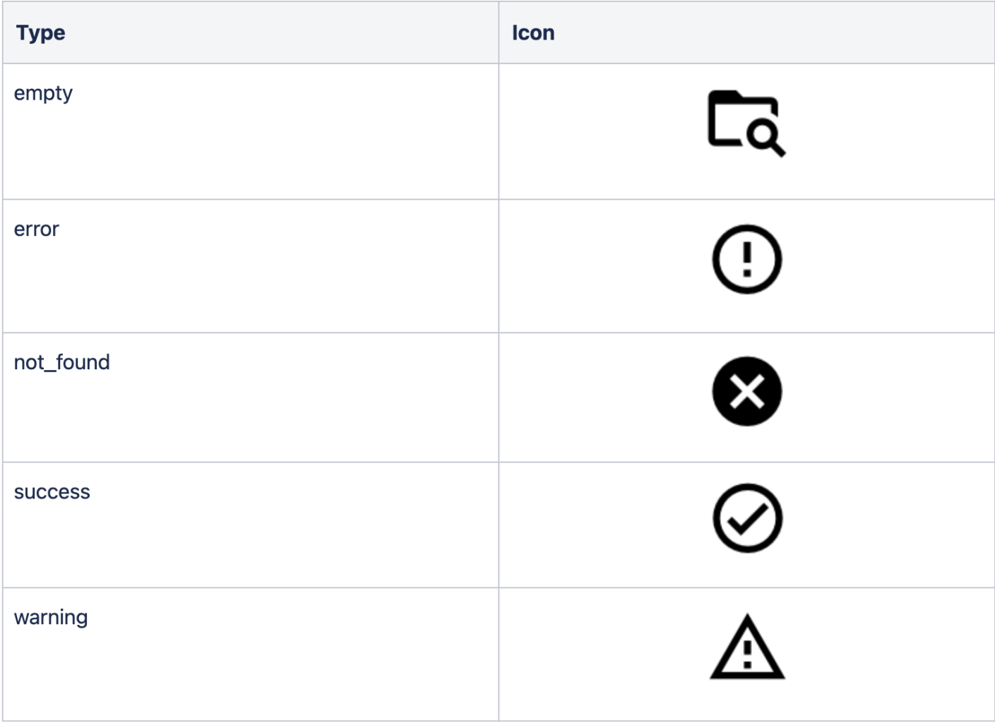
Figure 2 - Available types
The State component supports extra customization such as a description or buttons to perform actions:
- State.Description - allows providing a descriptive message with more details about the state scenario.
- State.Actions - container of available actions of the state. It can receive two buttons as children:
- State.PrimaryButton - a primary button that will be displayed on the state. Available property: onClick - the function that is triggered by clicking the button. E.g.
() => actions.goToExit("refresh"). - State.SecondaryButton - a secondary button that will be displayed on the state. Available property: onClick - the function that is triggered by clicking the button. E.g.
() => actions.goToExit("back").
- State.PrimaryButton - a primary button that will be displayed on the state. Available property: onClick - the function that is triggered by clicking the button. E.g.
// State with type error and title
<State type="error" title="Something went wrong" />

// State with type error, title and description
<State type="error" title="Something went wrong">
  <State.Description>Please contact your administrator</State.Description>
</State>

// State with type success, title, description and a primary button
<State type="error" title="Something went wrong">
  <State.Description>Please contact your administrator</State.Description>
  <State.Actions>
    <State.PrimaryButton onClick={() => actions.goToExit("back")}>
      Back
    </State.PrimaryButton>
  </State.Actions>
</State>

// State with type warning, title, description, primary button and a secondary button
<State type="warning" title="Can you confirm these changes?">
  <State.Description>You will not be able to revert this action.</State.Description>
  <State.Actions>
    <State.SecondaryButton onClick={() => actions.goToExit("back")}>
      Back
    </State.SecondaryButton>
    <State.PrimaryButton onClick={() => actions.goToExit("confirm")}>
      Confirm
    </State.PrimaryButton>
  </State.Actions>
</State>
TroubleshootingIf you have questions or technical issues, please open a ticket using this form.
Updated 6 months ago