Render Form
The Render Form component allows you to create interactive forms with a wide range of options. For example, you can prefill fields using variables or default values, and mark fields as required.
Similar to components, it is mandatory to provide a Component name (Figure 1 - 1).
The form Fields section (Figure 1) allows you to configure each form field you want to include. When you open the component editor, you have the option to add a title to the form (Figure 1 - 1) and configure one or more fields (Figure 1 - 2).
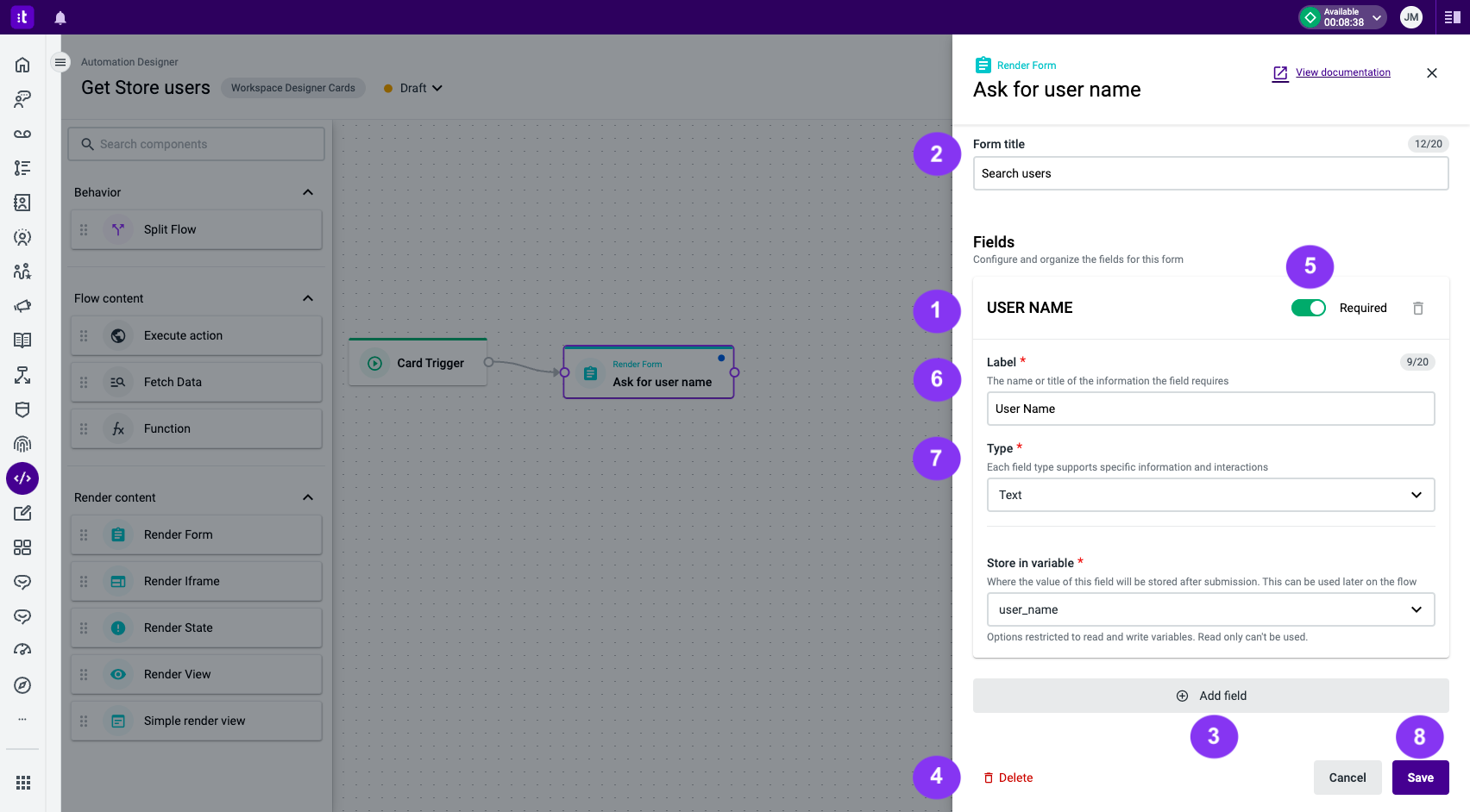
Figure 1 - Render Form editor panel
To add more form fields, click the Add field button (Figure 1 - 3). You can also remove a field that is no longer needed by clicking the delete icon (Figure 1 - 4).
A Render Form must always have at least one field. There is no maximum number of fields.
Each form field has the following configuration options:
- Required toggle (Figure 1 - 5) - mark the field as required by toggling the button.
- Label (Figure 1 - 6) - provide a caption for the form field (required field).
- Type (Figure 1 - 7) - select the type of form field from the available options.
The available form field types are:
Each component type has its own set of fields and a clear objective, as explained below.
When using Variables with default values, the form field will only be automatically filled if and when the variable has a value. If not, it will remain empty.
Text
The text form field type displays a simple text input (Figure 3). The following configuration options are available:
- Default value (Figure 2 - 1) - set the default value of the form field. You can choose between a variable or a specific value to automatically fill in this field.
- Store in variable (Figure 2 - 2) - specify the variable in which you want to store the field value after form submission. This stored value can be used later in the flow. Only read-write variables are available (required field).
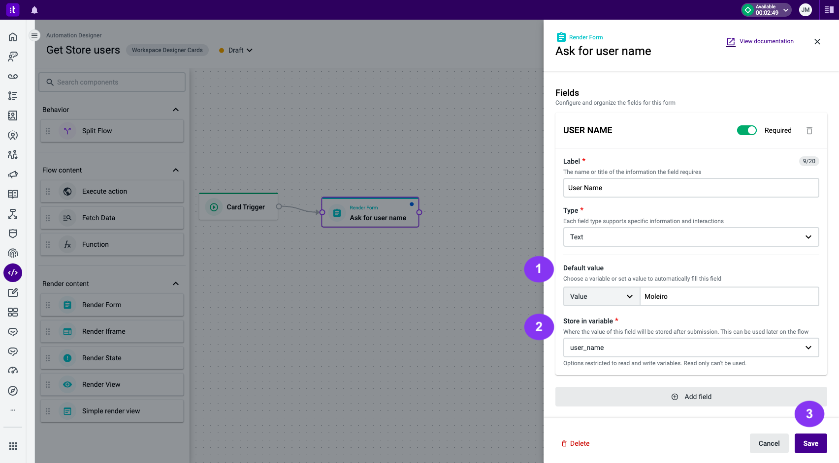
Figure 2 - Text form field type configuration
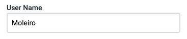
Figure 3 - A text input field rendered on a card
Once you have filled out all the form fields, click the Save button (Figure 2 - 3).
Textarea
The textarea form field type displays a textarea input (Figure 5). The following configuration options are available:
- Default value (Figure 4 - 1) - set the default value of the form field. You can choose between a variable or a specific value to automatically fill in this field.
- Store in variable (Figure 4 - 2) - specify the variable in which you want to store the field value after form submission. This stored value can be used later in the flow. Only read-write variables are available (required field).
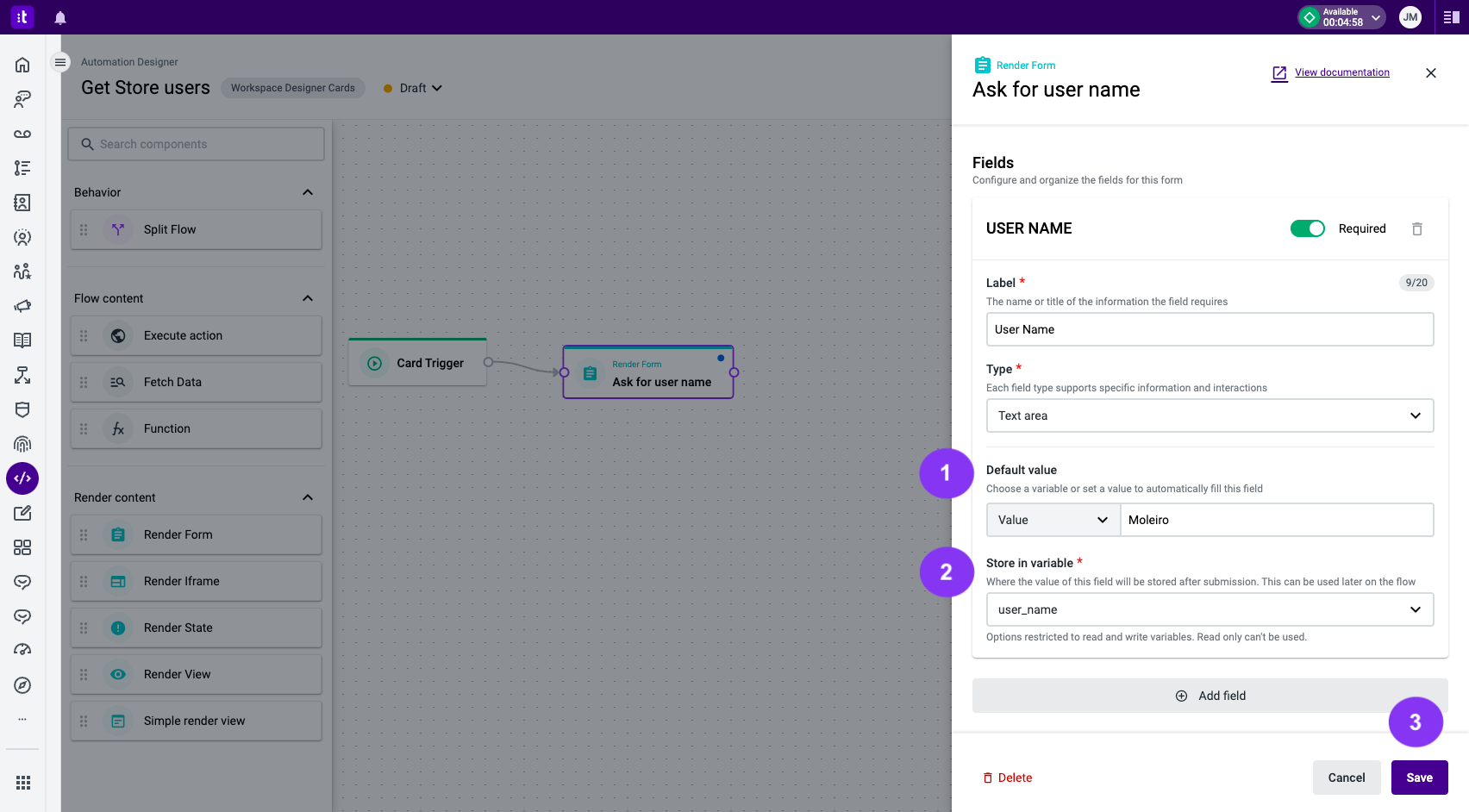
Figure 4 - Textarea form field type configuration
Figure 5 - A textarea input field rendered on a card
Once you have filled out all the form fields, click the Save button (Figure 4 - 3).
Checkbox
The checkbox form field type displays a checkbox (Figure 7). The following configuration options are available:
- Default value (Figure 6 - 1) - set the default value of the form field. You can choose between a variable or a specific value to automatically fill in this field.
- Store in variable (Figure 6 - 2) - specify the variable in which you want to store the field value after form submission. This stored value can be used later in the flow. Only read-write variables are available (required field). Once you have filled out all the form fields, click the Save button (Figure 6 - 3).
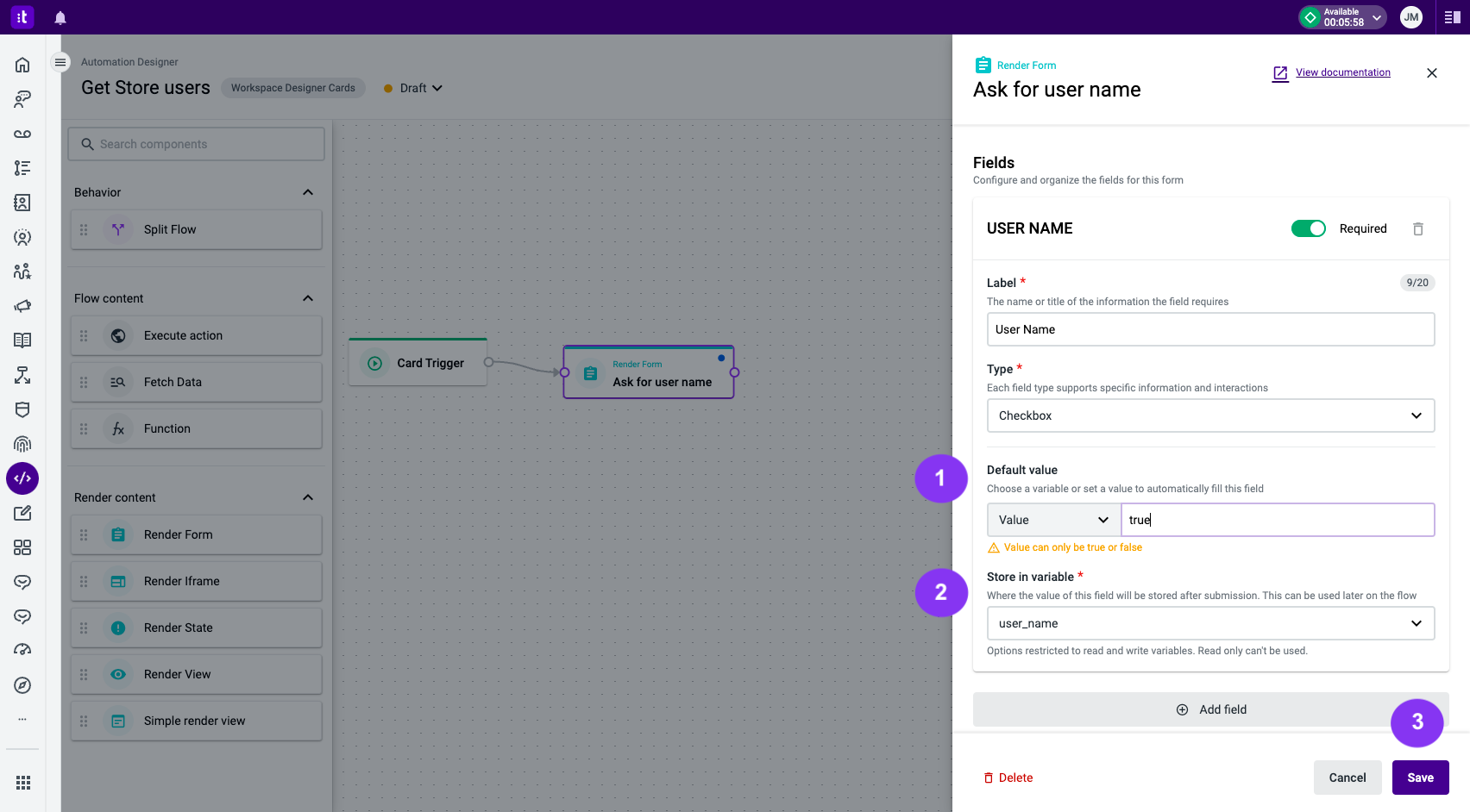
Figure 6 - Checkbox form field type configuration

Figure 7 - A checkbox input field rendered in a card
When using the Checkbox field type and adding a default value if:
- The value is from a variable, it must be true or false.
- You add a custom value other than true or false, it will be converted to true.
- The variable has a value of undefined, null, or an empty string, the checkbox will be blank. If there's no interaction, the value is preserved. Otherwise, it will be true or false, depending on the checkbox status.
Dropdown
The dropdown form field type displays a dropdown menu (Figure 11). The following configuration options are available:
- Configure manually (Figure 8 - 1) - for each dropdown option, you need to define a value (Figure 8 - 2) and a display name (Figure 8 - 3). You can add options by using the available buttons (Figure 8 - 4), or remove options (Figure 8 - 5). To pre-select a specific value, you can define it in the default value field (Figure 8 - 6). Once you have filled out all the form fields, click the Save button (Figure 7 - 8).
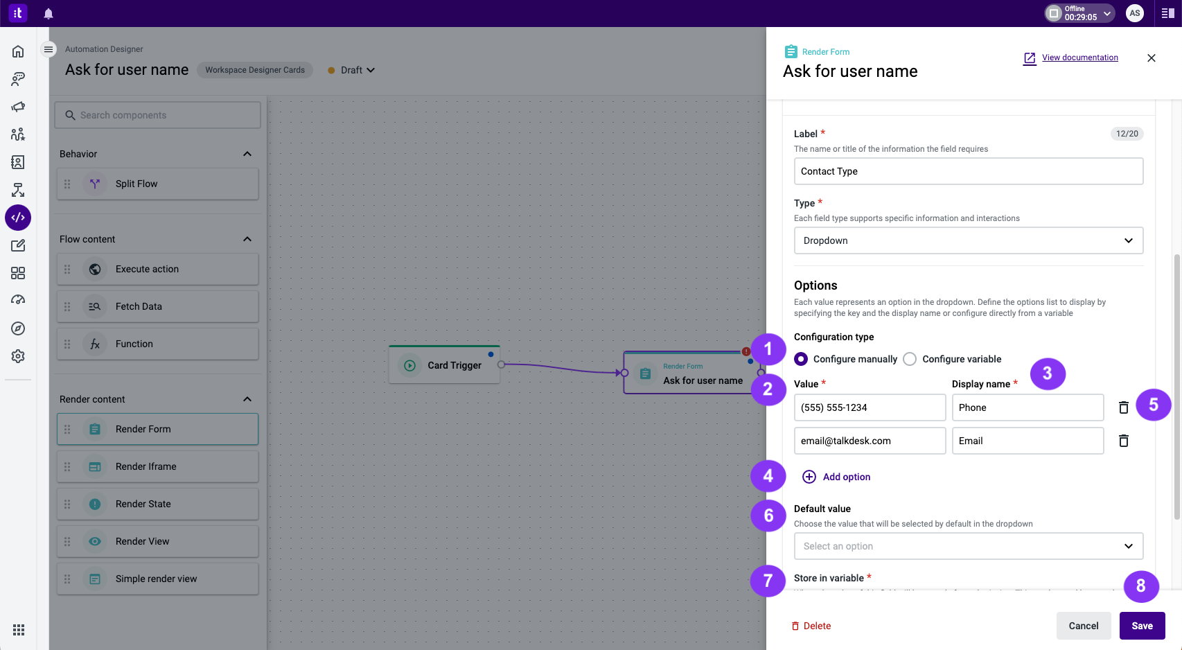
Figure 8 - Configure manually option in the dropdown form field type
- Configure variable (Figure 9 - 1) - when using this configuration type, you need to select a variable (required field) from the list (Figure 9 - 2) to populate the dropdown options. The variable must be an array or an array of objects.
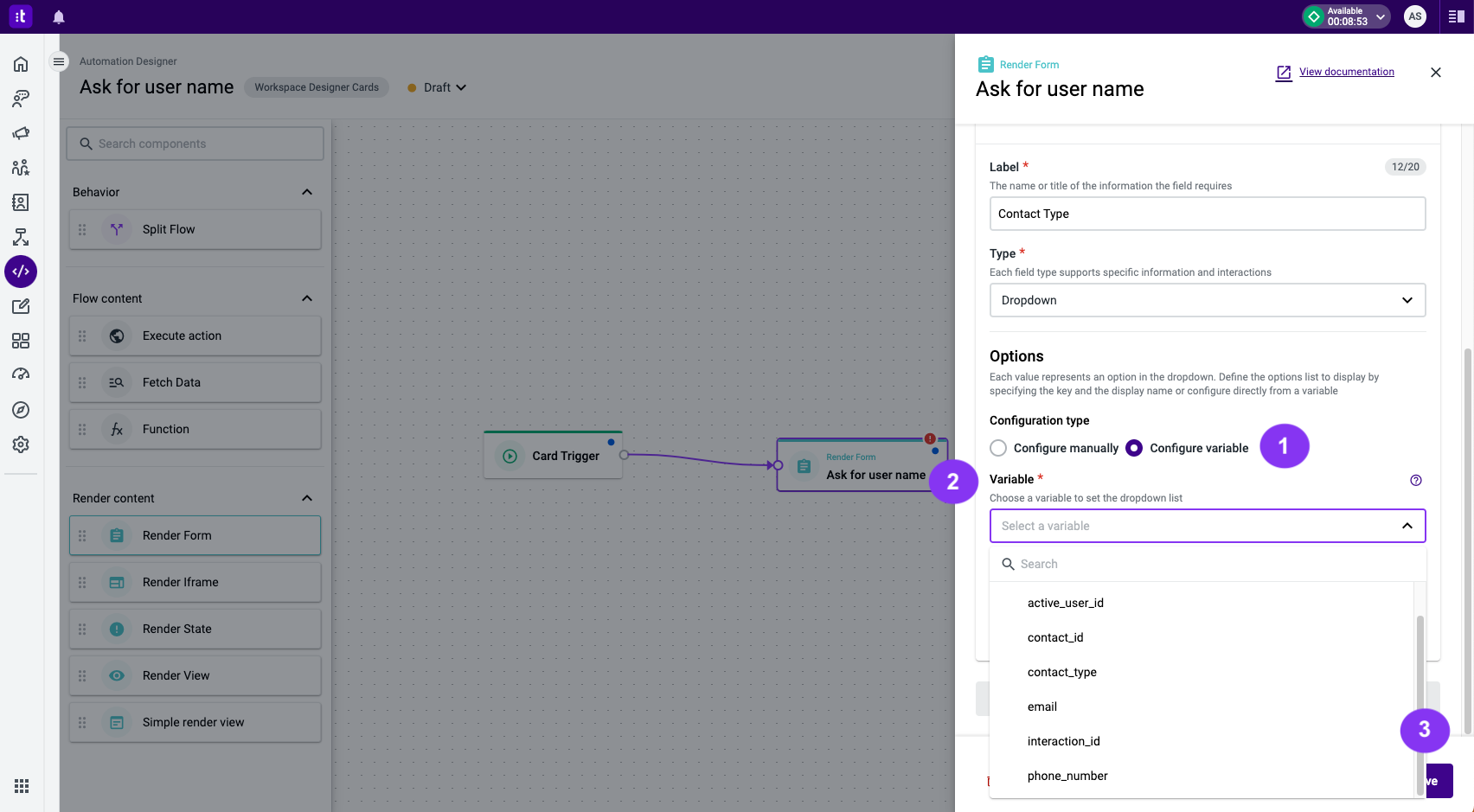
Figure 9 - Configure variable option in the dropdown form field type
The following snippet demonstrates how to use an array or an array of objects to feed the dropdown options list:
//Array variable
["Option 1", "option_2", 123]

//Array of objects variable
[
  {
    display_name: "Portugal",
    value: "+351"
  },
  {
    display_name: "United States",
    value: "+1"
  }
]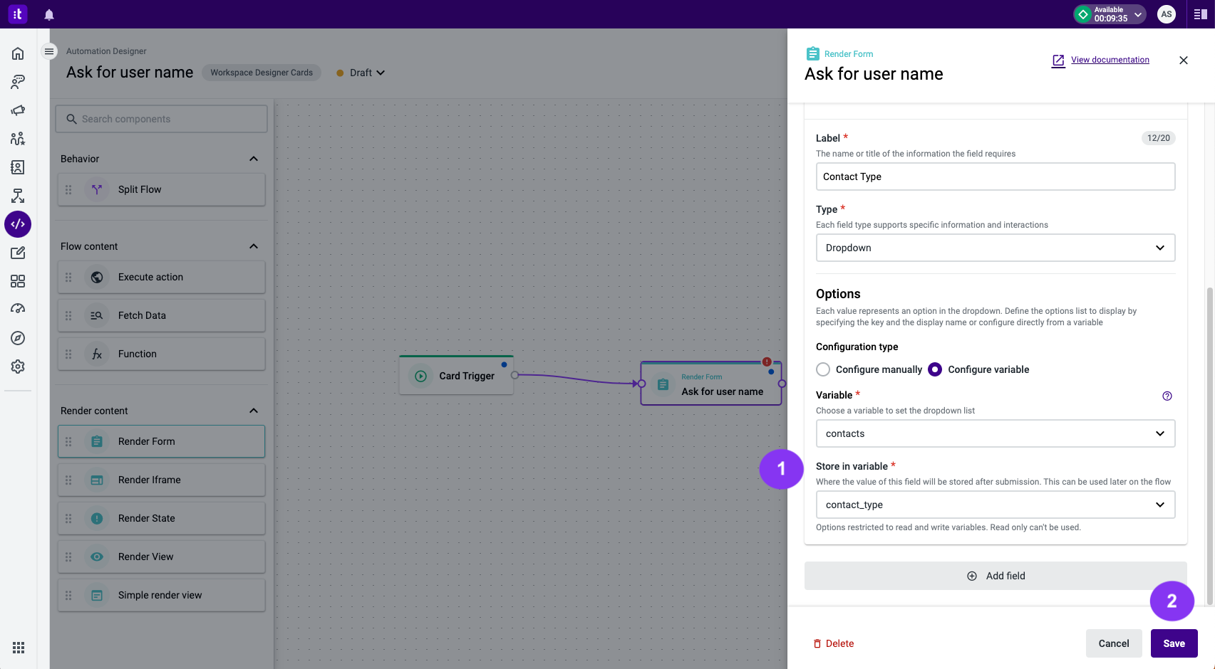
Figure 10 - Configure variable option in the dropdown form field type
To save the selected options, use the Store in variable field (Figure 10 - 1). This value will be available after the form submission, allowing you to use it later in the flow. Please note that only read-write variables are available for this purpose (required field).
Once you have filled out all the form fields, click the Save button (Figure 10 - 2).
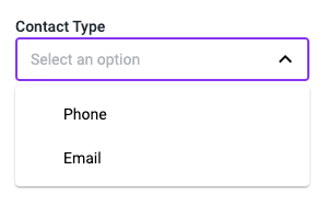
Figure 11 - A dropdown field rendered on a card
Custom
The custom form field type allows you to render any form field based on custom HTML and JSX (example in Figure 13). The following configuration options are available:
- Default value (Figure 12 - 1) - set the default value of the form field. You can choose between a variable or a specific value to automatically fill in this field.
- Store in variable (Figure 12 - 2) - specify the variable in which you want to store the field value after form submission. This stored value can be used later in the flow. Only read-write variables are available (required field).
- Code (Figure 12 - 3) - define the custom configuration of the form field using HTML and JSX. If a default value is defined, use
Field.getDefaultValue()in the code to retrieve the selected default value. To store the desired value in the chosen variable, useField.setValue(value).
Once you have filled out all the form fields, click the Save button (Figure 12 - 4).
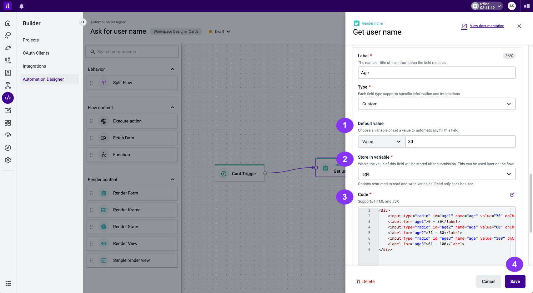
Figure 12 - Custom form field type configuration
Below (Figure 13) you can find an example of a custom component that will show a 5-star rating system.
This example uses custom styles and fonts
Talkdesk utilizes ReactJS and its state management system to compile the code.
Please note that certain HTML functionalities may not work correctly.
If you need to modify properties like
checked, please use the ReactJS compatible propertydefaultCheckedinstead.For setting the value to be saved in the variable, Talkdesk exclusively employs the
Form.setValuemethod.
<style>{`
@import url(//netdna.bootstrapcdn.com/font-awesome/3.2.1/css/font-awesome.css);
fieldset, label { margin: 0; padding: 10px 0 0 0; }
.rating { border: none; display: flex; flex-direction: row-reverse; justify-content: flex-end;}
.rating > input { display:none; }
.rating > label::before {margin: 5px; font-size: 1.25em; font-family: FontAwesome; display: inline-block; content: "\\f005";}
.rating > .half::before { content: "\\f089"; position: absolute;}
.rating > label { color: #ddd; float: right; cursor: pointer;}
.rating > input:checked ~ label, /* show gold star when clicked */
.rating:not(:checked) > label:hover, /* hover current star */
.rating:not(:checked) > label:hover ~ label { color: #FFD700;  } /* hover previous stars in list */
.rating > input:checked + label:hover, /* hover current star when changing rating */
.rating > input:checked ~ label:hover,
.rating > label:hover ~ input:checked ~ label, /* lighten current selection */
.rating > input:checked ~ label:hover ~ label { color: #FFED85;  }
`}
</style>
<fieldset className="rating">
    <input defaultChecked={Field.getDefaultValue() === "5"} type="radio" id="star5" name="rating" value="5" onClick={() => { Field.setValue(5)}} /><label className="full" for="star5" title="Awesome - 5 stars"></label>
    <input defaultChecked={Field.getDefaultValue() === "4"} type="radio" id="star4" name="rating" value="4" onClick={() => { Field.setValue(4)}} /><label className="full" for="star4" title="Pretty good - 4 stars"></label>
    <input defaultChecked={Field.getDefaultValue() === "3"} type="radio" id="star3" name="rating" value="3" onClick={() => { Field.setValue(3)}} /><label className="full" for="star3" title="Meh - 3 stars"></label>
    <input defaultChecked={Field.getDefaultValue() === "2"} type="radio" id="star2" name="rating" value="2" onClick={() => { Field.setValue(2)}} /><label className="full" for="star2" title="Kinda bad - 2 stars"></label>
    <input defaultChecked={Field.getDefaultValue() === "1"} type="radio" id="star1" name="rating" value="1" onClick={() => { Field.setValue(1)}} /><label className="full" for="star1" title="No good - 1 star"></label>
</fieldset>
Figure 13 - A custom field rendered on a card
Troubleshooting
If you have questions or technical issues, please open a ticket using this form.